Brand
Brand Guidelines
A short manual on how to use the WHATS brand: logo, colors, typography and voice. Please follow these rules whenever you represent WHATS in press, partnerships or retail.
1. Logo
The WHATS wordmark is the primary identifier of the brand. Always use the official files — never recreate, redraw or distort the logo.
Clear space
Keep a margin around the logo equal to the height of the "W" on all sides. Don't crowd it.
Don'ts
- Don't stretch, rotate or skew the logo.
- Don't change its colors outside the approved palette.
- Don't add shadows, outlines or effects.
- Don't place it on busy backgrounds without enough contrast.
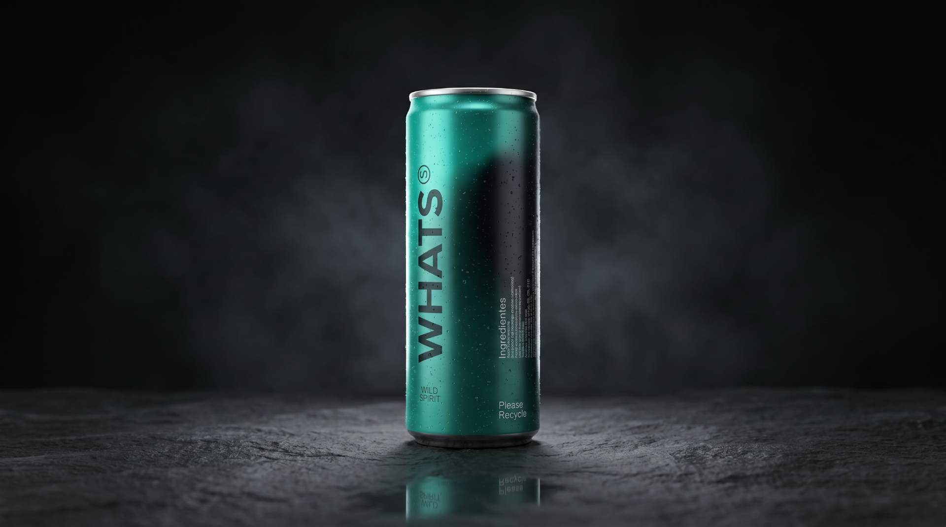
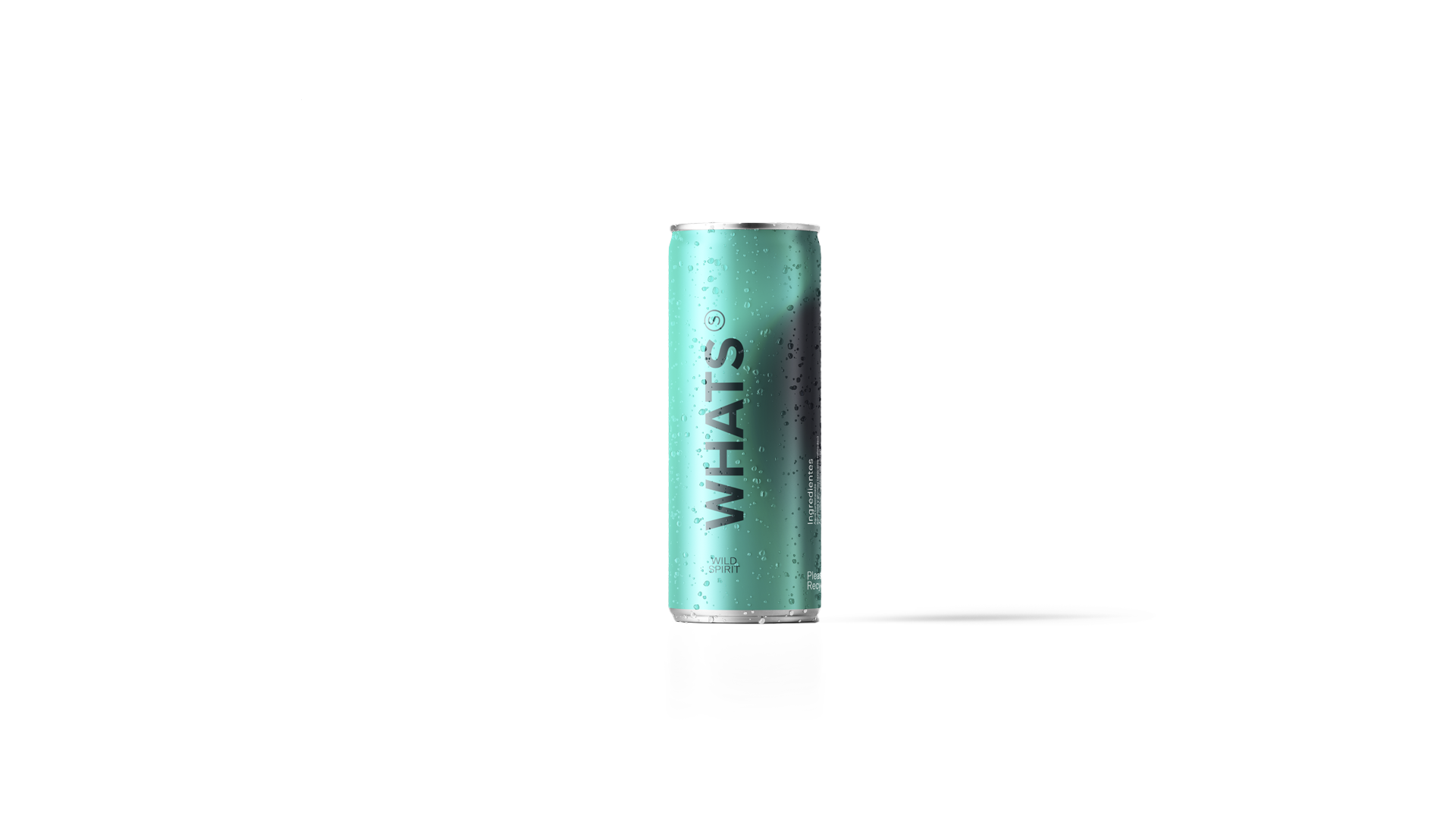
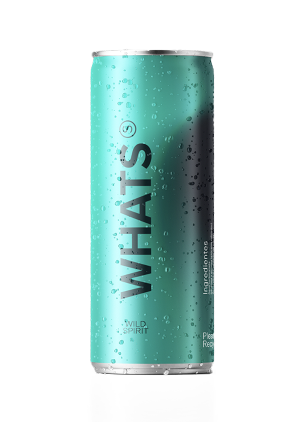
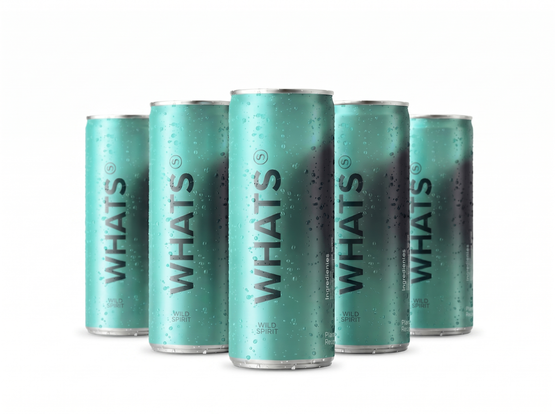
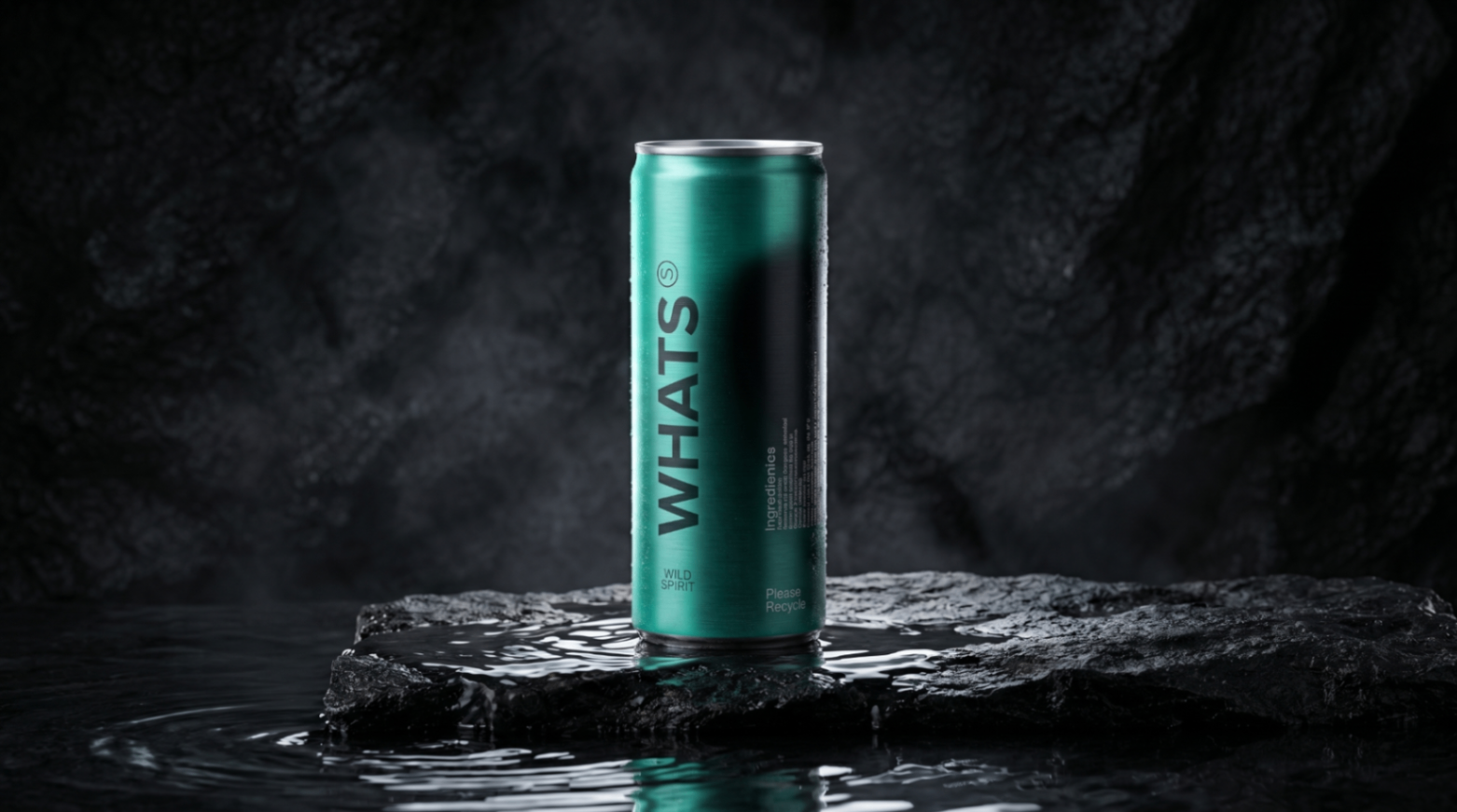
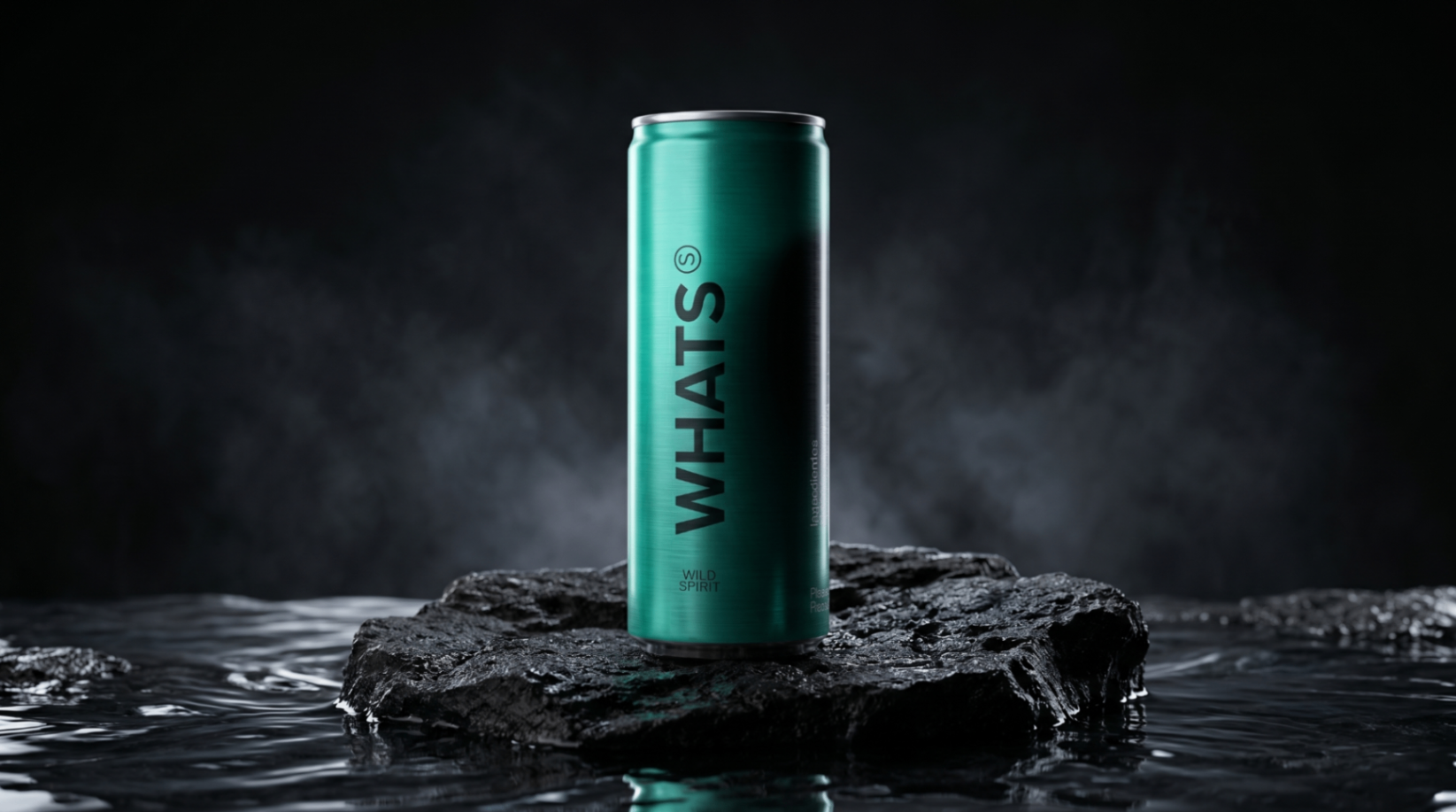
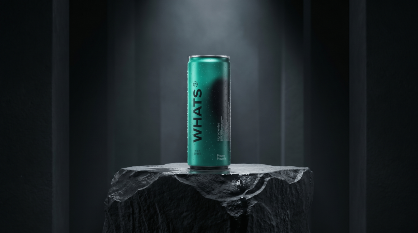
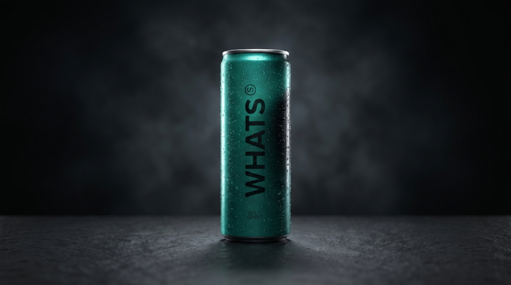
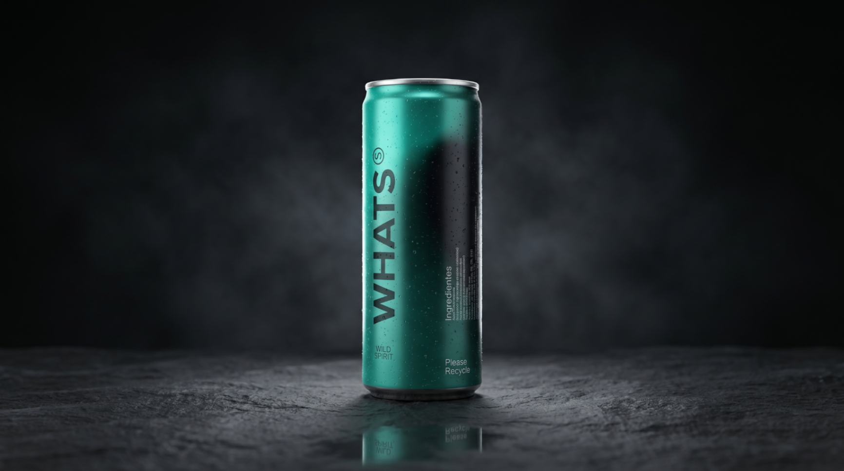
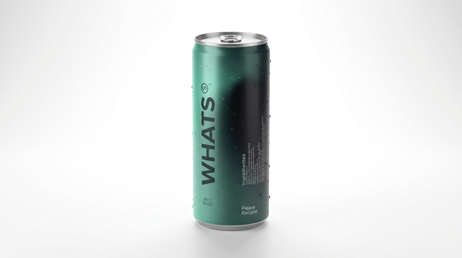
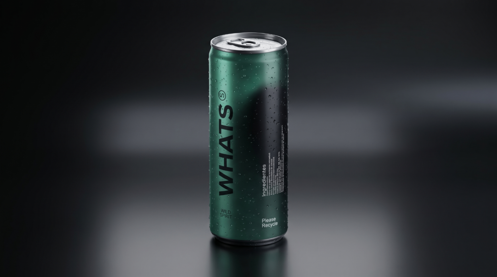
2. Product assets
Official can imagery for press, retail and partner use. Please don't recolor, crop the wordmark out or composite the can over distracting backgrounds.
3. Color palette
WHATS uses a warm, confident palette built around ink black, warm white and ginger.
4. Typography
Headlines use our display typeface in tight tracking and generous size. Body copy is set in a clean sans-serif at comfortable reading sizes. Keep hierarchy strong: one big idea per block.
5. Tone of voice
- Direct. Short sentences. No fluff.
- Honest. We talk about what's in the can and why it matters.
- Energetic. Built around movement, training and real routines.
- Human. We speak to people, not to consumers.
6. Imagery
Use natural light, real athletes and real environments. Avoid stock-looking shots. Product photography should feel clean, crisp and confident — the can is the hero.
7. Press & partnerships
For high-resolution assets, vector files or co-branded materials, contact press@drinkwhats.com.